Timeline:
2023
Hats Worn:
UX Design
UX Research
Project Management
Team:
2 UX Designers
2 Visual Designers
2 Textile Experts
3 Medical Experts
⚠️
Note: Some details have been adapted to respect confidentiality, but the case study reflects the real work and impact.

TL;DR / Quick summary
I led the UX design of a mobile and tablet app that paired with a wearable garment to support seniors over 60 living with chronic arthritis.
We began with focus groups and usability sessions to understand their routines, pain management habits, and expectations from technology. Insights shaped early wireframes and prototypes that prioritised simple navigation, larger text, and supportive reminders. We designed flows for pain logging before, during, and after activities, with options to track patterns and receive gentle prompts to build consistency. Usability testing refined everything from copy and pain scale labelling to practical details like orientation preferences, garment alerts, and battery visibility.
By the end, we delivered a first-of-its-kind concept that combined smart textiles with an accessible app. Early trials showed seniors found it simple, trustworthy, and relevant to their daily lives.
Arthritis is one of the most common chronic conditions affecting seniors, especially those over 60. It limits mobility, undermines independence, and often leaves people juggling scattered tools to manage pain, such as paper diaries, half-remembered notes, or health apps that were never designed for them.
This project set out to tackle that gap. The vision was a wearable garment that could deliver targeted electrotherapy at set times during the day, paired with a companion app that made it simple for seniors to log pain, track usage, spot patterns in their condition, and eventually, share it with their GP or care teams.
The work took place within the Global Smart Lab and the E-Textile Innovation Lab, research environments at the intersection of design, health, and technology. These labs specialise in combining smart textiles, inclusive design, and advanced prototyping to create healthcare solutions that enhance quality of life. Being part of that ecosystem meant our design process had scientific depth, clinical oversight, and the freedom to explore what the future of arthritis care could look like.
Problem
Managing arthritis pain was rarely straightforward for the people we spoke to. Most relied on memory or scribbled notes to track their symptoms. Some used generic health apps, but found them confusing, cluttered, or irrelevant. The result was inconsistent records and no clear way to see patterns over time.
For seniors, the barriers were even higher. Small fonts, too many steps, or unfamiliar icons turned simple tasks into obstacles. Pain logs often asked for more information than people were willing or able to provide, especially when they were already in discomfort. The tools available didn’t match the realities of living with chronic pain.
The garment introduced a new layer of opportunity, but it also created new challenges.
🤨
How could we design an app that made using the garment intuitive, helped track pain in meaningful ways, and respected the limits of what people were comfortable with?
The problem was not just to capture data, but to make the experience simple, respectful, and useful for people over 60.
My Role
I was the lead UX designer on this project, guiding a team of four designers while working closely with textile engineers, medical researchers, and clinicians. My responsibility was to shape the design direction, mentor junior designers, and make sure the work we produced stayed grounded in the realities of the people who would use it.
I designed and facilitated focus groups and usability tests with seniors to understand their mental models, preferences, and limitations. From this research, I translated insights into flows and prototypes, testing them directly with participants and refining based on their feedback.
I also took ownership of the app’s design system, ensuring it was consistent, accessible, and adaptable across both mobile and tablet. This included larger tap targets, high-contrast colours, and clear text-first navigation to support older users.
Beyond the design craft, I acted as the bridge between disciplines. I coordinated with textile specialists on how the garment would be used day-to-day, collaborated with medical experts to define what needed to be tracked, and worked with engineers to make sure what we designed was feasible. My role was to bring those perspectives together into a product that felt both clinically credible and simple for seniors to use.
The project was inherently interdisciplinary. We had textile specialists working on the garment, medical researchers defining clinical requirements, and designers and developers (engineers) responsible for shaping the digital experience. To bring all of that together, our approach had to be both collaborative and evidence-driven.
We decided early on that research would be the bridge between disciplines. Each group had different priorities. Textile engineers focused on wearability and fit, clinicians focused on accuracy and safety, and designers focused on usability and clarity. To align these perspectives, we built a process where findings flowed openly across the team.
Focus groups and usability tests were led by the design team, but protocols were co-created with medical researchers to make sure we captured the right kind of data. Textile specialists attended sessions as observers so they could see directly how participants interacted with the garment in everyday scenarios. Findings were then synthesised into structured summaries and shared back with all disciplines, often through visual storyboards or feedback decks, so insights were accessible and not just locked in reports.
I also set up a cadence for sharing. Weekly cross-team meetings became spaces to review research highlights, discuss feasibility, and align on priorities. Alongside that, I maintained a project log that acted as a single source of truth, capturing updates, questions, and ongoing decisions. This kept clinicians, engineers, and designers on the same page despite working from very different perspectives.
Our approach was deliberately iterative. Instead of treating research as a one-off exercise, we tested in cycles: early sketches, mid-fidelity flows, and garment interactions. Each cycle included participant feedback and refinements, which were then fed back into both the garment and the app. This rhythm helped us stay aligned as a team and built confidence that what we were designing was clinically relevant, technically feasible, and genuinely usable for seniors.


Our interdisciplinary team
Research Insights
From focus group discussions with seniors, we gathered early insights into what they wanted from a system that could support garment use and pain management.
Simplicity above all
Participants did not want to answer too many questions or go through long, complicated flows. They asked for easy navigation and minimal clicks, with the interface focused on the essentials.
Activity-based tracking
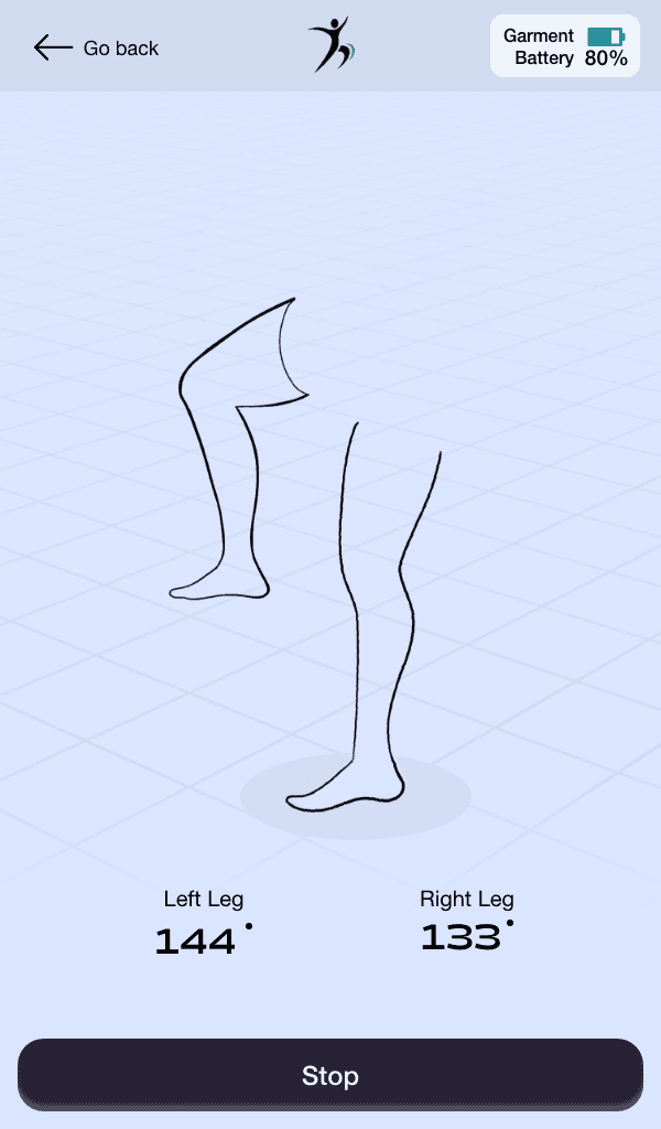
Many thought about their pain in relation to daily activities such as walking or cycling. They wanted to log scores before, during, and after these activities to help spot patterns.
Communication and reassurance
Some participants expressed interest in being able to message a healthcare professional directly through the app. Even if this was not in scope, it highlighted the importance of reassurance and connection.
Pattern awareness
Participants liked the idea of the app surfacing usage patterns over time. Suggestions included prompts like “You used the garment at 3pm yesterday, would you like to use it today?” to encourage consistency.
Practical preferences
Device size was an important factor. Some seniors preferred the portability of a phone, while others preferred a smaller tablet (around 7 inches) rather than larger devices.
These insights reinforced the importance of designing something simple, context-aware, and directly relevant to daily routines.
Execution
With research insights in place, we moved into design. The aim was to translate what participants told us into an app that felt simple, accessible, and relevant to their routines.
I began with low-fidelity wireframes to map the core flows: logging pain, starting a garment session, and reviewing patterns over time. These early sketches helped validate structure and navigation before moving into higher fidelity. We prioritised large tap targets, clear text-first labels, and high-contrast colours to support readability for seniors.
The designs were then expanded into high-fidelity prototypes for both mobile and tablet. We created a version optimised for each to make sure the system worked across different contexts of use.
The design system became the foundation for consistency. Built on accessibility principles, it included scalable typography, reusable card components, and role-based layouts. Pain logging was designed to be fast and intuitive, activity tracking allowed entries before, during, and after use, and notifications were kept lightweight and supportive.
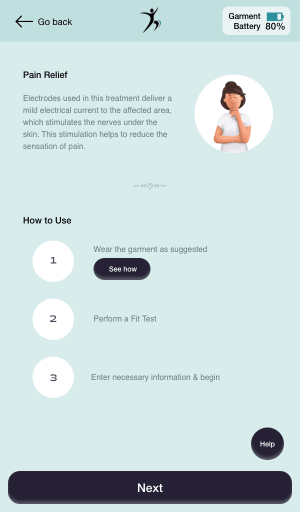
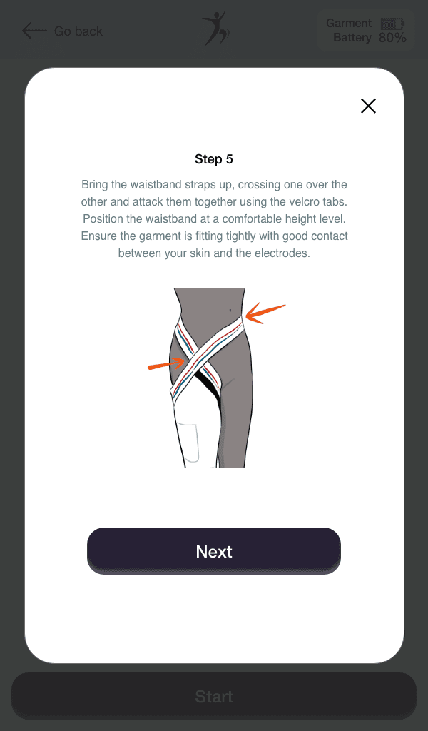
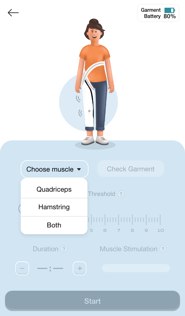
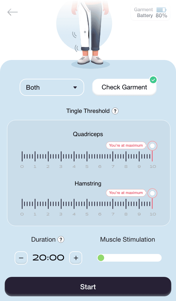
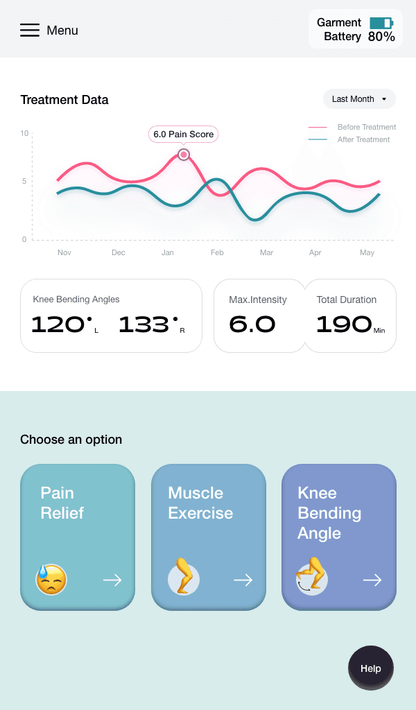
A snippet of the screens from the final app
Testing
Once wireframes and early prototypes were in place, we ran usability sessions with seniors to understand how the app performed in practice. These sessions revealed what resonated and what needed refinement.
What worked well
Participants consistently appreciated the app’s simplicity. They described the navigation as straightforward, the font sizes and colours as readable, and the overall design as accessible. Even a colour-blind participant reported no issues with visibility, which confirmed that accessibility principles were paying off.
Where we needed to improve
Feedback and reassurance: Alerts were requested to notify if the garment was not positioned correctly, since many intended to use it while walking or cycling.
Language and tone: Certain terms, like “exercise” and “garment fit test,” were confusing. Onboarding copy that promised “complete pain relief” was seen as insensitive, since arthritis is a lifelong condition. We reworked the language to be clearer and more empathetic.
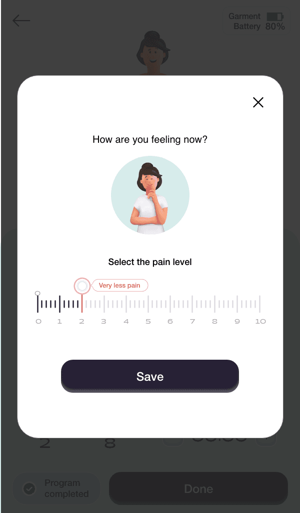
Pain scale clarity: Participants wanted a scale that started at 0 and ended at 10, with anchors that reflected real experiences. One described it as “0 means no pain, 10 means I cannot move.” This feedback shaped how we labelled the scale.
Contextual details: Participants wanted the ability to add notes when logging pain, since factors like weather often influenced their condition.
Practical preferences: Portrait orientation was preferred overall, but participants asked for auto-rotate as well. They also wanted to see garment battery percentage and be notified when it was running low. Distinct colours for treatment types were suggested, though left to us to decide.
Icons vs. text: Text was preferred over icons, or at minimum, text alongside icons for clarity.
Overall, the feedback was encouraging. Seniors confirmed that the app felt simple and usable, while their suggestions gave us clear, actionable ways to make it even more supportive and trustworthy.
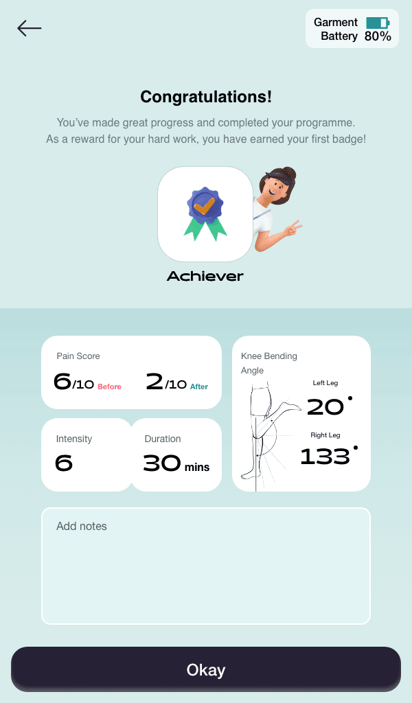
By the end of the project, we had delivered a working design system and prototypes for both mobile and tablet, shaped directly by the voices of seniors living with arthritis. The app made it easy to log pain, track usage, and receive supportive reminders, while the garment provided targeted therapy in daily routines.
Early testing showed strong validation of the concept. Seniors described the app as simple, readable, and accessible, with features that reflected their real needs — from adjusting garment intensity to noting weather as a pain factor. Clinicians and textile experts saw the value of having a system designed with usability at its core, not bolted on as an afterthought.
The work contributed to:
The first integrated garment-and-app concept for arthritis care within the lab.
Accessible, scalable designs delivered across both mobile and tablet.
A design system that ensured consistency and adaptability for future iterations.
Positive early trials, where participants reported stronger confidence in managing their condition and greater trust in the garment.
While much of the underlying research remains under NDA, the process proved that combining smart textiles with user-centred digital design could create tools that felt credible to clinicians and empowering for seniors.
Reflections
Leading the design of this project taught me a lot about what it takes to create technology that people over 60 can actually use and trust. Seniors do not want more features, more buttons, or more jargon. They want simplicity, empathy, and tools that respect the reality of living with a condition like arthritis.
One of the biggest lessons for me was the importance of language. Small choices in copy — like avoiding promises of “complete relief” — made a big difference in how participants felt about the app. Building trust was as much about words as it was about flows or colours.
Working in a multidisciplinary team was another key learning. Textile experts cared about wearability, clinicians cared about accuracy, and we as designers cared about usability. Bringing those perspectives together was not always easy, but the process of aligning research and insights across disciplines showed me how design can act as a bridge.
Finally, this project reinforced the value of iteration. Each cycle of testing added something new, whether it was a subtle copy change or a functional request like garment alerts or note-taking. Over time, these refinements turned a concept into something seniors felt was simple and supportive.
For me, this project highlighted what I enjoy most about design: solving complex challenges by making them feel human.

